Webpage for New Students
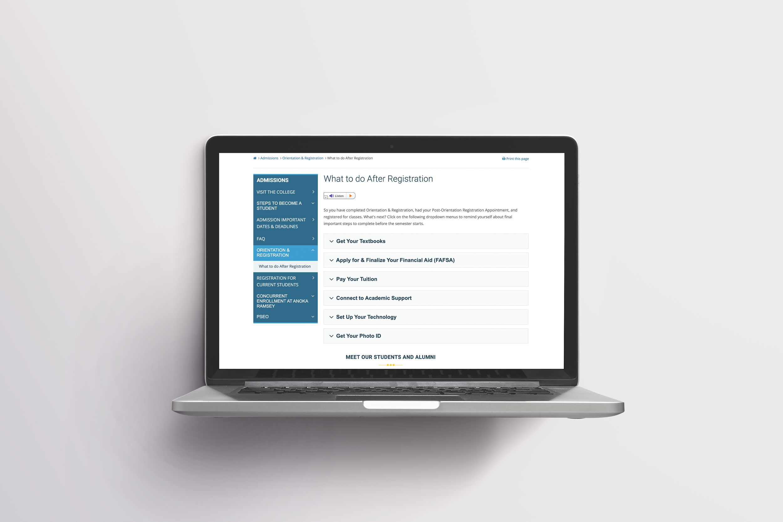
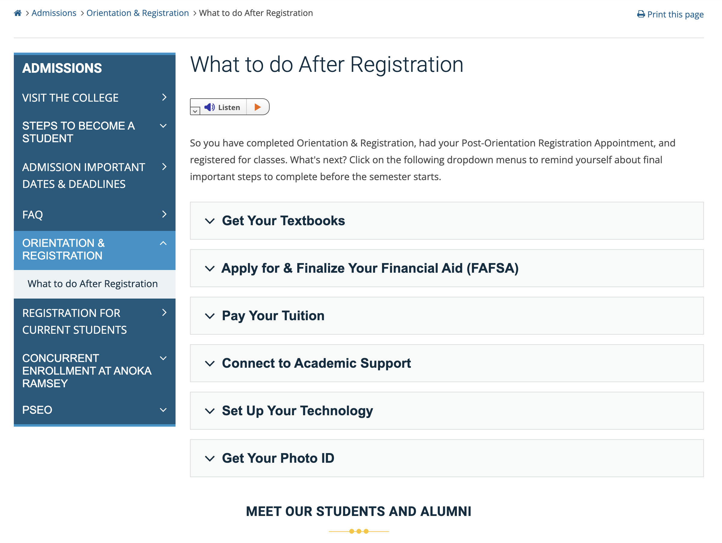
I was the main designer leading the creation of this webpage and also oversaw the copywriting. This specific project was a collaboration effort between multiple cross-functional teams to create a webpage for Newly Registered Students. The aim of the webpage was to be used as a checklist tool with clear and concise steps that students needed to complete before starting their semester. This was an extremely important tool because it contained information that could dictate a student’s success such as completing their FAFSA, tuition payments, and obtaining their student id. If a student failed to complete one of these steps, it could very well mean they would not be able to finish a class. The end result was sending thousands of students per semester to this webpage so they know what steps they needed to accomplish next.
Technology
Umbraco (CMS system)
Role
Designer, Copywriter
Stakeholders
Advising team, Student Life team and the Marketing team
Link
http://www.anokaramsey.edu/admissions/new-student-orientation-registration/what-to-do-after-registration/
Challenge
Design a webpage for Newly Registered Students that would be used as a tool, so they may understand what they need to accomplish before starting their semester.
Goal
To ensure the success of our students we needed clearly defined goals with our stakeholders on what the webpage should accomplish. The webpage should:
Have all necessary items listed that students need to complete before starting a semester.
Contain easy and digestible information.
Present information clearly to not confuse students.
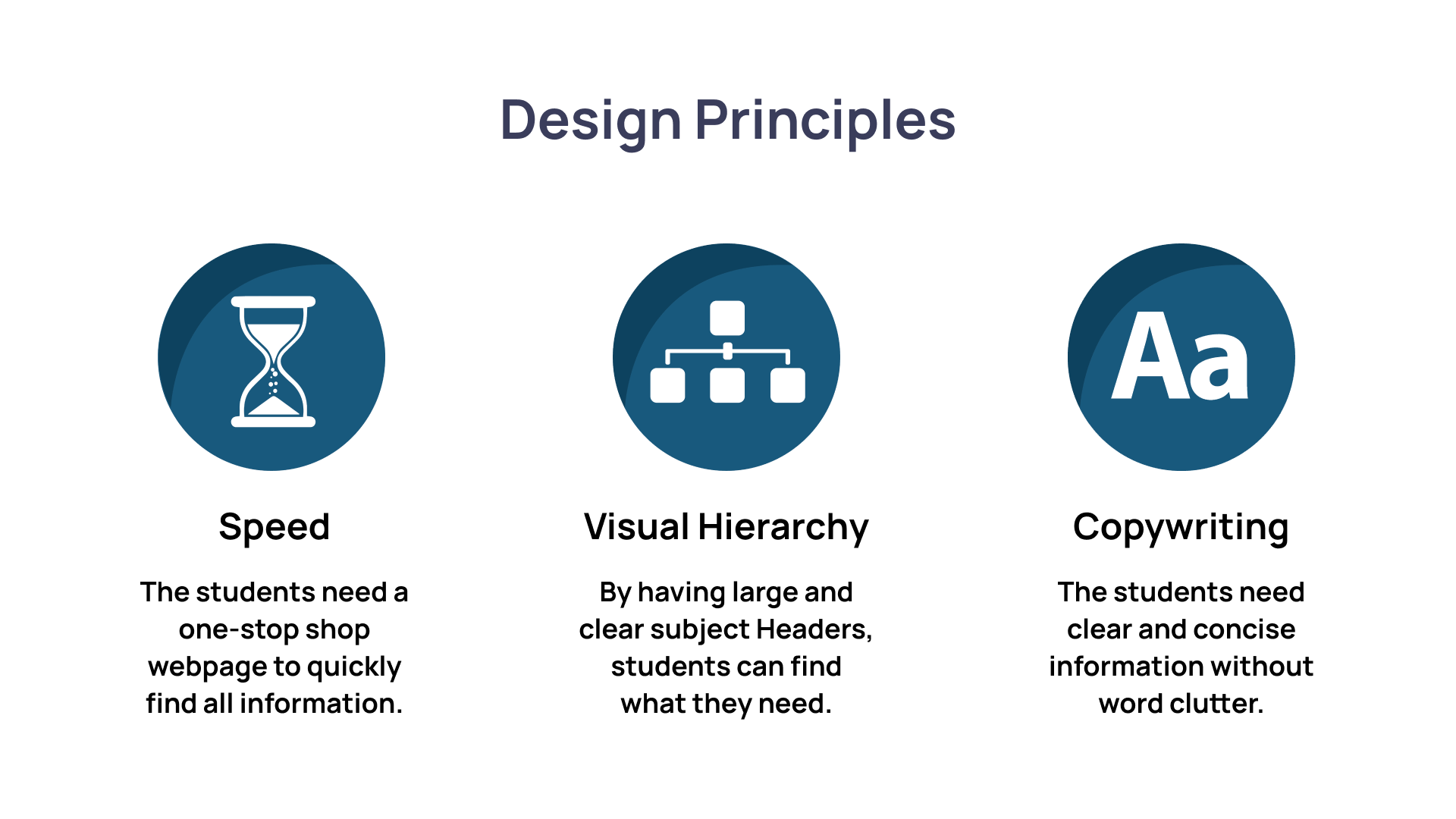
Design Principles
By adhering and applying these design principles, we will be able to achieve all of our goals for the webpage and provide a clean User Experience.
Early Concepts
The early concepts of the webpage that were thrown around, included “flip-card” type boxes that students would have to click on if they wanted to find information about a subject. The stakeholders thought that it might be more interactive and “fun”, however it detracted from the goals of the actual webpage because it would cause a lot more confusion and nuances within the User Experience. The goals of the webpage were to eliminate nuances and confusion as important information was being relayed to their success.
Results
After reiterating the goals of the webpage, I was able to articulate how the design of an accordion menu would fulfill the goals of:
Being a checklist styled tool so students may know what tasks to complete.
By having clear large Headers and implementing visual hierarchy would allow students to not be confused and digest content easily when clicking on the drop-down boxes to present information and not overwhelm them.
Students, warmly received the checklist styled webpage and found it super simple to use. We now send thousands of Newly Registered students to this webpage every year and have even formatted whole events such as Kick Start (an event for new and incoming students) to provide the information on this webpage at the event when discussing Anoka-Ramsey Community College. What started as a simple webpage to help advisors with their students, to sending thousands of students this webpage in emails and formatting whole events, a simple webpage that was well constructed with content and information hierarchy proved to be extremely useful and changed a static webpage into a product.


