MySelf MyHealth website redesign
I was the primary designer for the redesign of the MySelf MyHealth website at Hennepin County. My role for this website was to bridge the gap between users and the use of the website as a tool that teens can come to in need of help with resources for trusted, affordable sexual health clinics
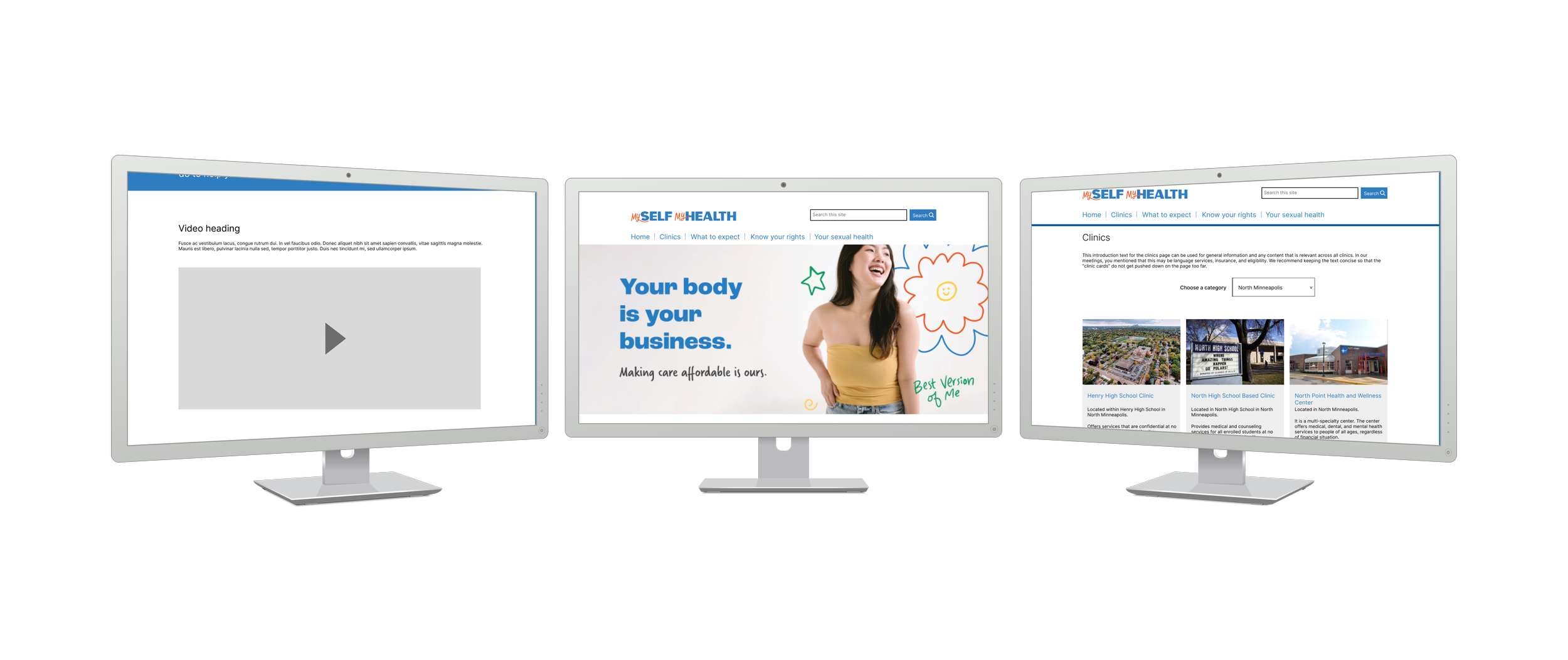
To bridge this gap, I made design decisions that addressed issues of the users. Gathered information from SiteImprove and Google Analytics to inform our team and stakeholders of those decisions. We then mocked the content strategy in plain language that contained only the most necessary of information and I visualized that strategy through wireframes in Figma.
Technology
Figma, SiteImprove, Google Analytics, Sitecore
Role
Designer, Copywriter, UX and content strategist
Stakeholders
Content strategists, Hennepin County public health department, Metre digital agency, and web developers
Link
Challenge
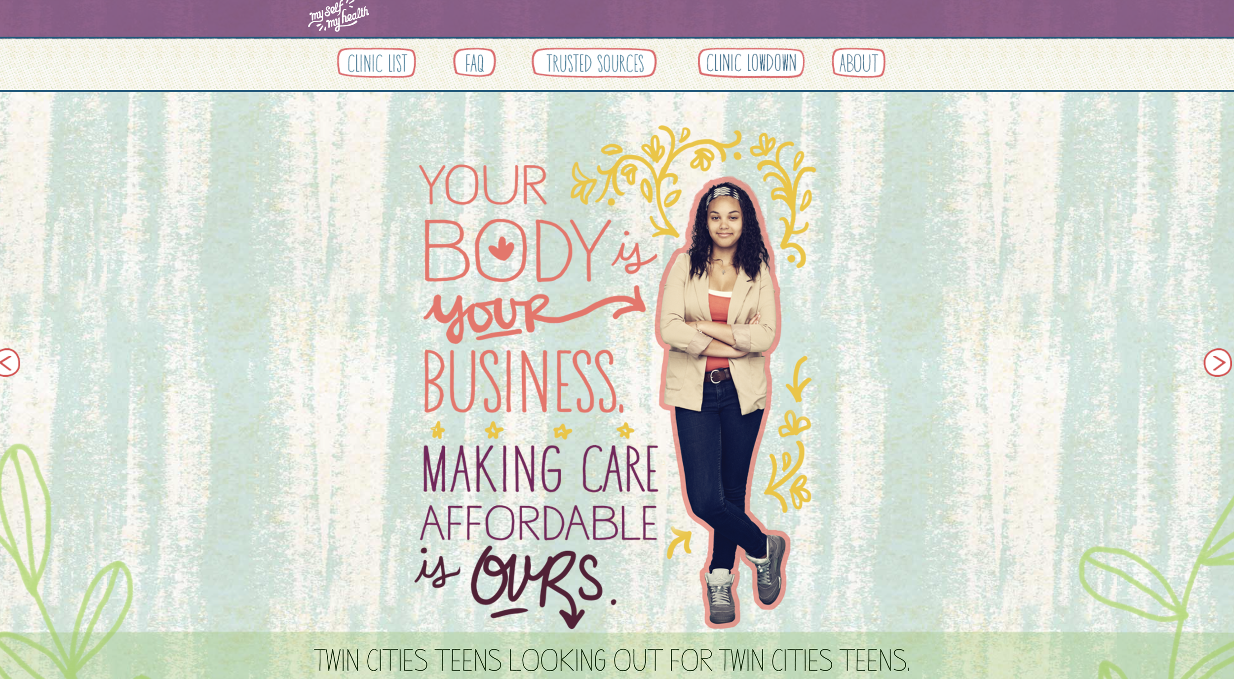
The current website is outdated and currently does not reflect modern design trends, users are confused as to what they are looking at when first entering the website, unsure if they’re on a Hennepin County website and the content strategy of the website contains information that is redundant nor useful to the users.
Goal
To ensure the success of our students we needed clearly defined goals with our stakeholders on what the webpage should accomplish. The webpage should:
Ensure content strategy is in plain language so that information is readable, findable and useful.
Update the visual design to modern standards.
Present information clearly to not confuse users and reduce content clutter.
Content strategy
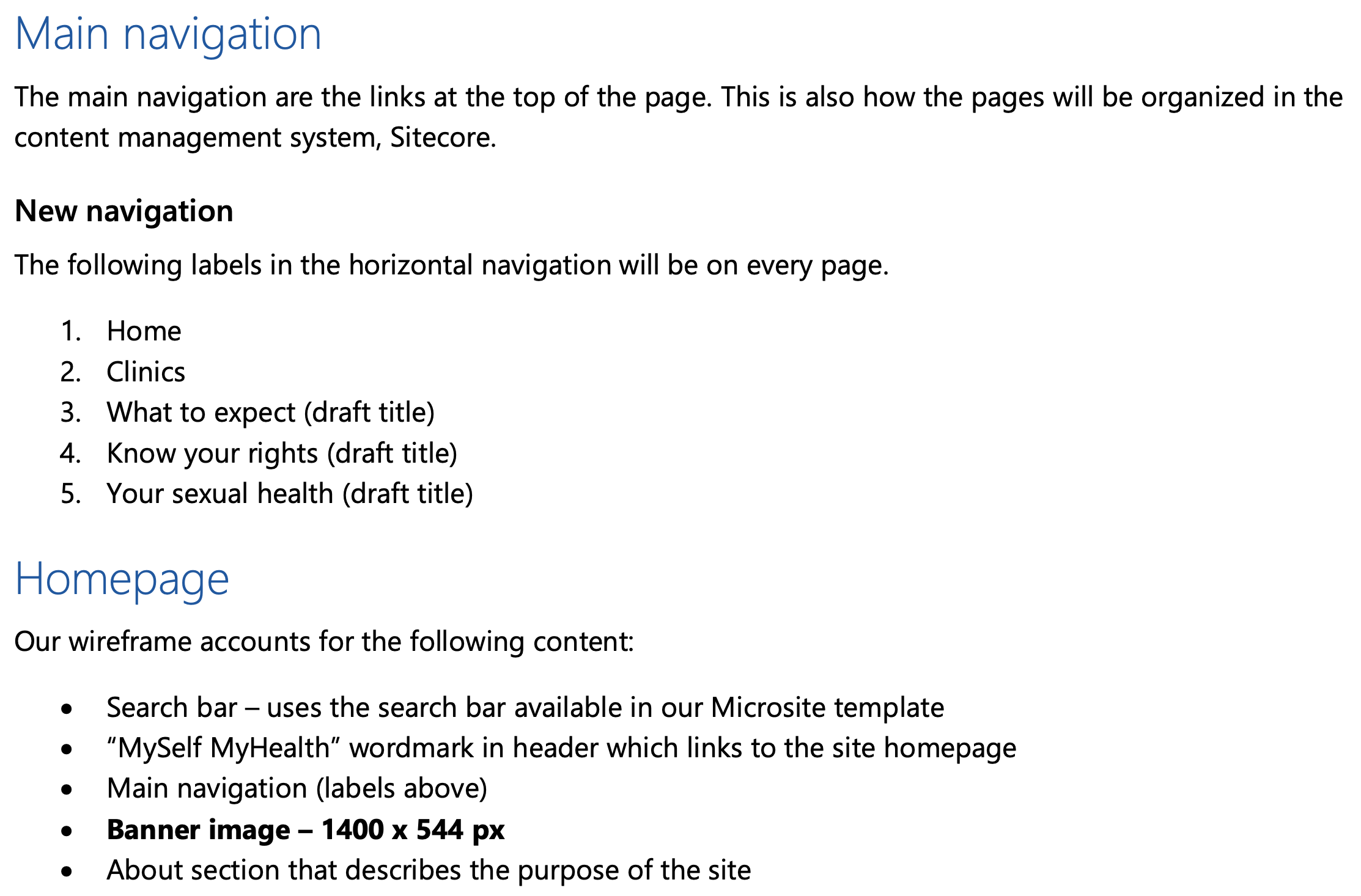
In one part of our design process, we mocked a content strategy document that addressed navigation. The current navigation had no “Home” navigation page, it was also confusing with “Clinic list”, “Clinic lowdown” and “Trusted sources” pages that weren’t very user friendly. Users visiting the website for the first time had no idea what those meant nor how to get back to the home page.
Our content strategy plan addressed these issues early on by outlining precisely how the main navigation should be laid out. This would cut down content to only the most necessary, “Clinic list”, “Clinic lowdown” and “trusted sources” to “Clinics”. Providing a friendlier User Experience.
Copywriting
Our content strategy plan also described the need of rewriting copy to be in plain language (Hennepin County writing style). We prioritized information to be easily findable, readable, and useful. Here is an example taken from an excel spreadsheet that we had of clinic descriptions. The clinic descriptions in the middle were written by the Public Health department at Hennepin County in partnership with Metre a creative marketing agency. On the far right is my revised version that I wrote and was reviewed by another content strategist in our internal web communications team.
The content is more concise by reducing filler words and separating out the location from the clinic description. It also lists the most useful information to teenagers looking for clinic services that was strategized by our content plan:
What ages does this clinic accept
Is insurance recommended or are all patients accepted
Results
Through the careful curation of our content strategy plan, we were able to address flaws within user experience and friendliness to create a fluid UI that addresses these needs. Users know exactly where they are at and getting information more intuitively when navigating the site.


